
Many brands today want to feel clean and elevated online, but often miss the whole point: conversion. A minimalist website may look visually appealing, but is it actually helping users navigate efficiently and make decisions? Aesop is a brand that successfully balances restraint, usability, and storytelling throughout its online platform. Their website proves that minimalism can still feel functional, intentional, and conversion-focused when executed correctly.
Brands need to create websites that users can scan quickly and move through naturally, especially as shorter attention spans continue to rise. Implementing principles from the Design for Usability framework can help reduce friction between the user and the website. Clear navigation, visual hierarchy, and neatly defined areas help make a website feel intuitive instead of overwhelming. Upon entering Aesop’s website, users are met with a calm and refined experience, yet they are still able to confidently find products, categories, and information without confusion.
The Difference Between Aesthetic and Effective
Aesop’s landing page is a strong example of how brands can maintain an editorial and emotionally-driven aesthetic while still supporting usability principles. As shown below, the website uses a restrained color palette, organized navigation bar, strong typography, and clearly defined sections to guide the user naturally throughout the page. Even with its minimalist approach, the website still makes product categories, navigation, and the CTA easy to identify.
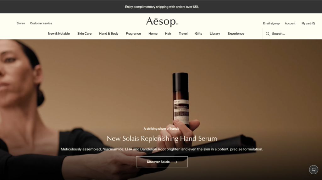
This reflects several principles from the Design for Usability framework from Digital Marketing Essentials, including creating effective visual hierarchy, following website conventions, and formatting content to support scanning behavior. Another usability principle Aesop demonstrates is consistency. Navigation, typography, spacing, and page layouts remain predictable throughout the experience, allowing users to focus on products rather than learning how the website works. The user’s eye naturally moves from the logo, to the hero image, to the product headline, and finally toward the CTA. Nothing on the page feels overwhelming or distracting, yet the website still feels emotionally engaging and brand-driven.
Many brands today attempt to replicate minimalism but mistake simplicity for the removal of functionality. I’ve personally come across fashion websites that prioritize aesthetics so heavily that basic navigation becomes difficult. Hidden hamburger menus, unclear product categories, and nearly invisible CTAs may look elevated from a design perspective, but they often force users to spend more time figuring out how to shop than actually shopping. While minimalism can create a premium feeling, it becomes ineffective when users have to work harder to find information or complete a purchase.
Why This Matters for Conversion
Good conversion-centered design is not always loud or aggressive. Sometimes the highest-converting websites are the ones that feel the easiest to navigate. When users feel comfortable, understand where to go, and can quickly process information, they are more likely to stay on the website longer and complete a purchase. From a business perspective, usability can influence important metrics such as bounce rate, time on site, pages viewed per session, and ultimately conversion rate. A website that reduces friction encourages deeper engagement and increases the likelihood that visitors will move through the purchasing journey.
Aesop’s website succeeds because its simplicity supports usability instead of competing with it. The clean layout, neutral color palette, organized sections, and readable typography create trust and reduce cognitive overload for the user. Rather than overwhelming visitors with excessive pop-ups, clutter, or competing visuals, the website allows the product and brand story to remain the focus which ultimately supports conversion.
As someone who has worked in luxury fashion, I’ve seen firsthand that customers are drawn to beautiful experiences, but beauty alone rarely drives a purchase. The strongest digital experiences balance aesthetics with usability, making it easy for shoppers to discover, understand, and ultimately purchase a product.